We enhanced and streamlined the signer experience in Box Sign. This includes updates to the signer navigation user experience and how signers interact with the document they have been sent for review and signature.
Specifically, updates include:
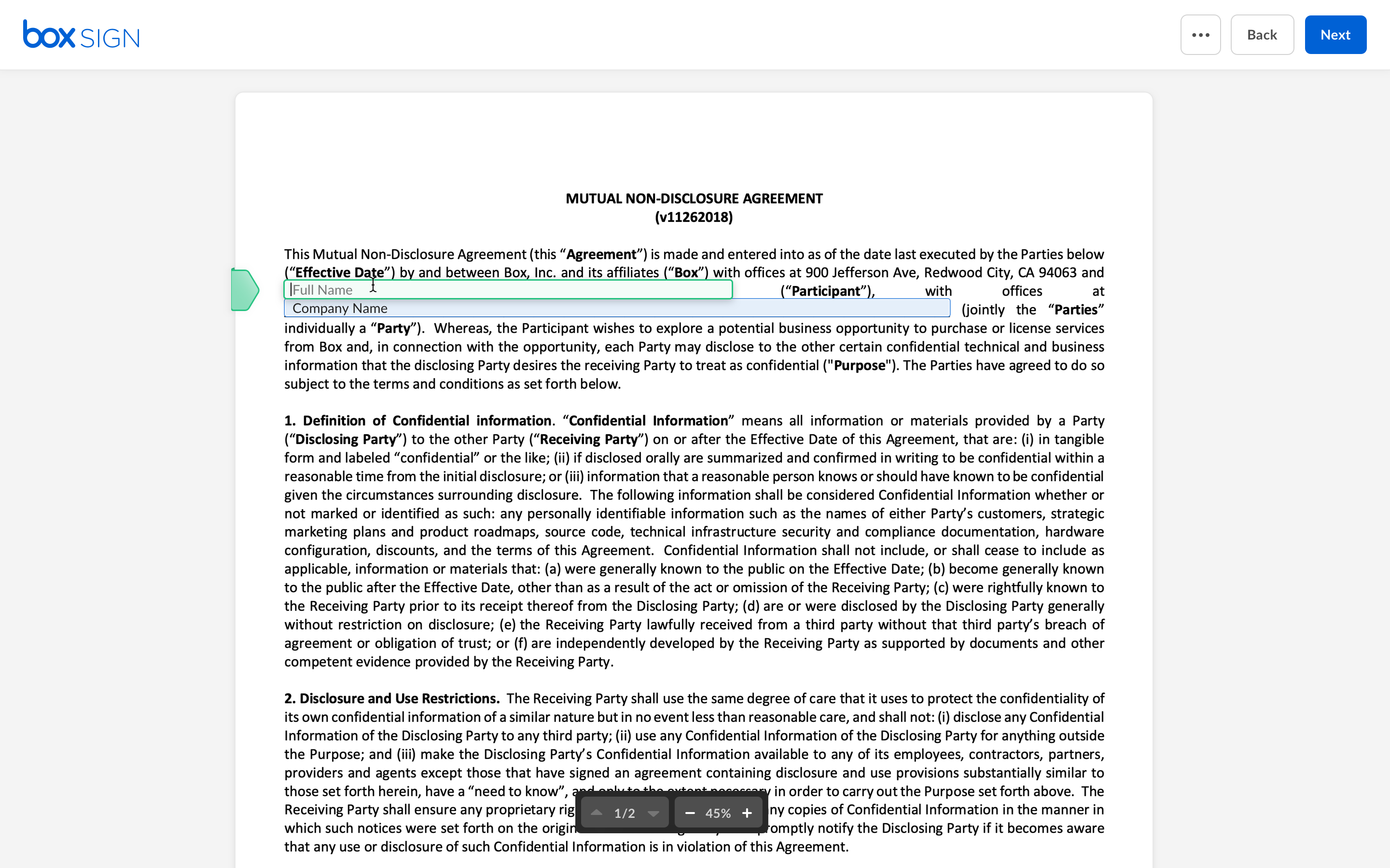
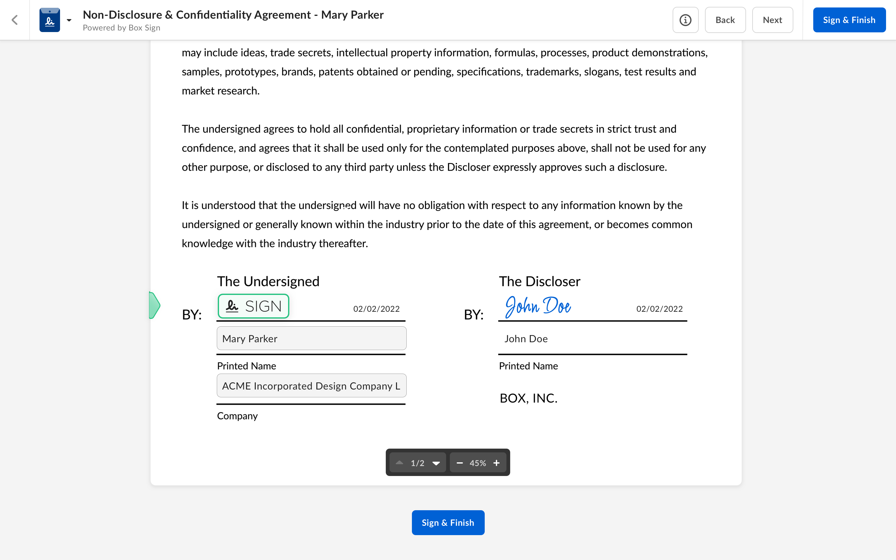
- Navigational buttons (Begin/Next/Back)in the header to improve how signers move through fields within a document, including an additional ‘Sign & Finish’ button at the end of the document
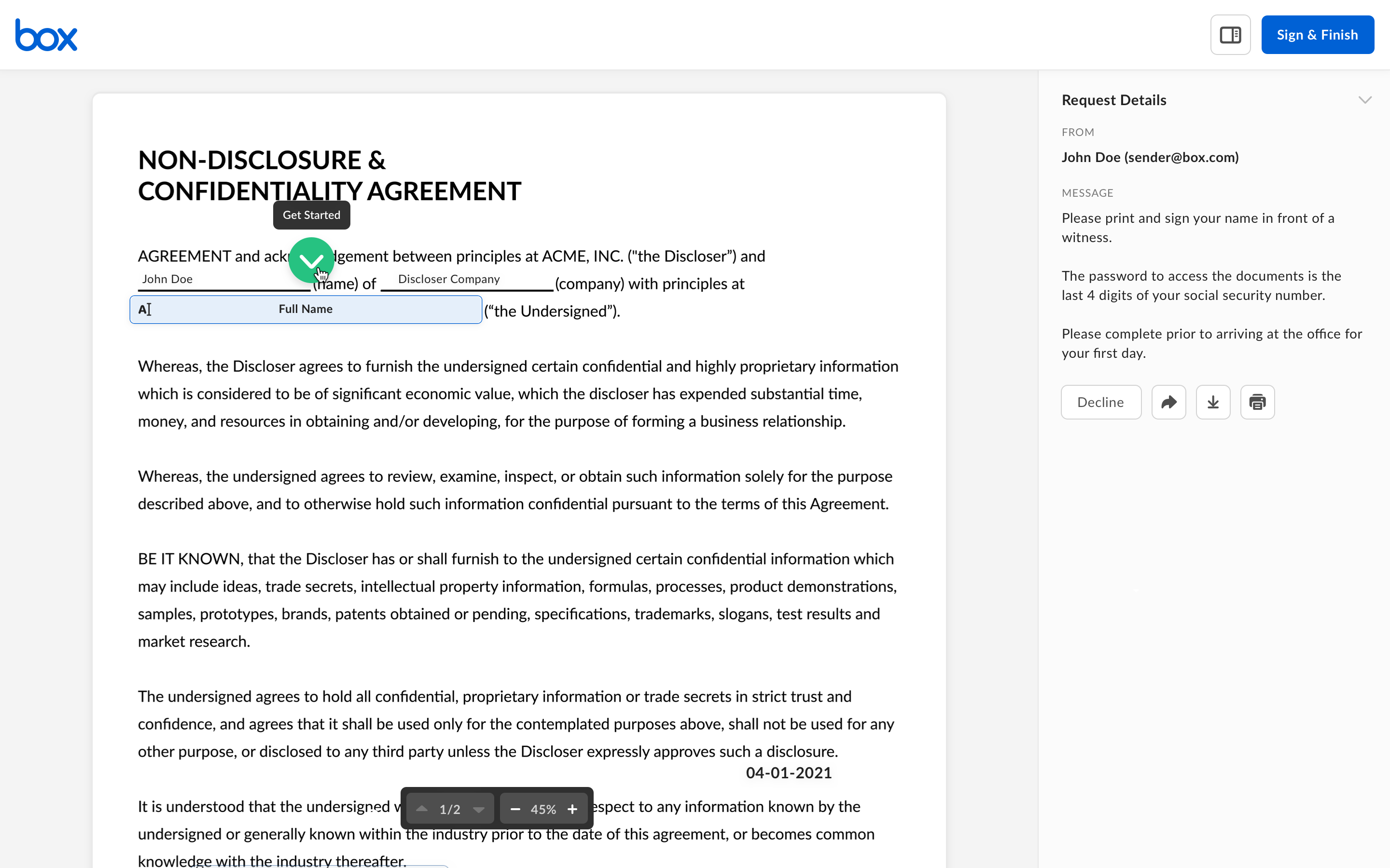
- Improved navigational guidance - replacing the bouncing green arrow with a green tab that tracks along the side of the document
- A progress bar to show signers how many mandatory fields are left to be completed
- A revised ERSD layout - a banner on desktop, and bottom sheet on mobile
Please see below screens showing the 'before' and 'after' for the enhanced signer experience:
BEFORE:

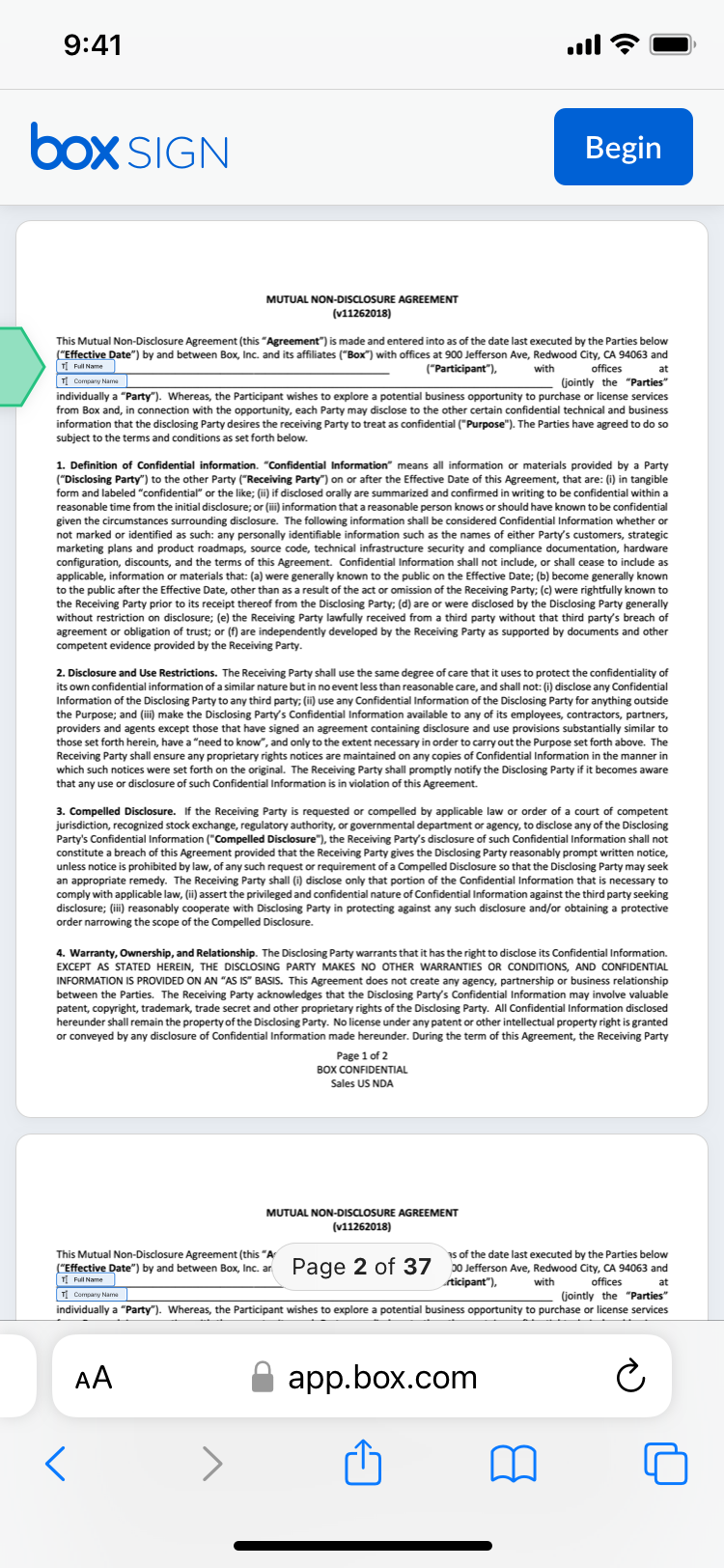
AFTER:
- Green tab
- Next and Back buttons

- Sign and Finish buttons

- Mobile experience
