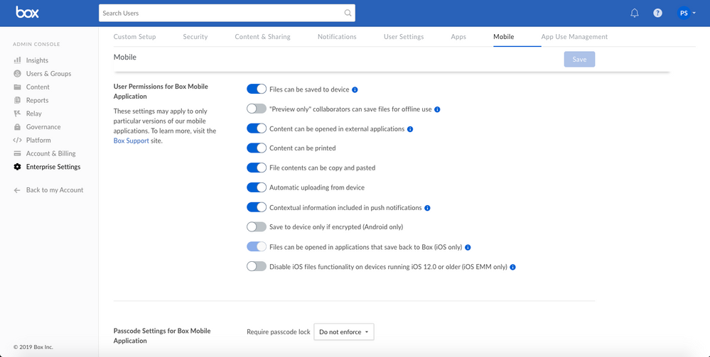
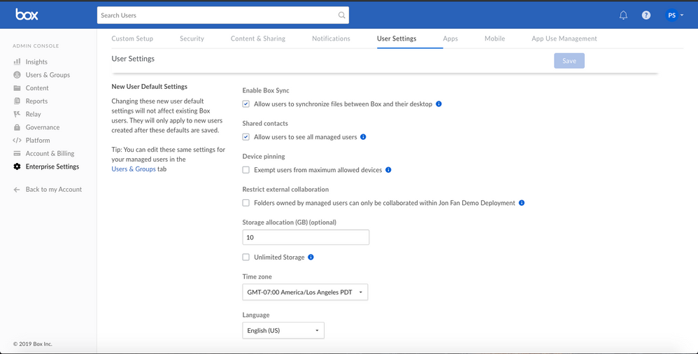
In April 2019, we launched our first set of updates to two Admin Console Enterprise Settings tabs: (1) Security and (2) Content & Sharing. We are now launching our second set of updates to the next set of critical Enterprise Settings tabs: (3) Mobile and (4) User Settings!
Improvements and Impact for Admins:
- 1) Faster page load time for all four tabs.
- Impact: Page load previously took almost 20 secs or more. The average page load time for these tabs will now be less than 3 seconds.
- 2) Cleaner UX overall, with improved overall layout, a more intuitive ordering of the sections, easier to understand descriptions, tooltips, and Learn More links.
- Impact: This new setup and UX will help admins better understand what they're setting up and how different settings are grouped together.
- 3) Save button sticky at top right of page (versus at the very bottom of a long page).
- Impact: This will help avoid admins leaving the page without saving any changes that were made.
- 4) Top of each tab has a description of page and Learn More link.
- Impact: Clarity on what admins will find on each tab and easy access to specific Community resources.
- 5) Sticky header that shows which tab you're on even as you scroll the page.
- Impact: Improved navigation across the entire Enterprise Settings section of the Admin Console.
What's Next:
- This is v2 of our Admin Console Enterprise Settings improvements. Please continue to share feedback so that we can make more improvements in the second half of the year as well.
- Updates to all of the associated Community pages will be coming by the end of July.
Example of new UX and layout for the two updated Enterprise Settings tabs:
Example of new Enterprise Settings: Mobile tab UX and layout
Example of new Enterprise Settings: User Settings tab UX and layout

